Technology involving search-based photo recognition fascinates me!
It sparked my interest in creating a mobile application for fashion shoppers to search for clothes using photos and categories. This mobile application is easy to use
with its welcoming color palette and recognizable icons.
It sparked my interest in creating a mobile application for fashion shoppers to search for clothes using photos and categories. This mobile application is easy to use
with its welcoming color palette and recognizable icons.
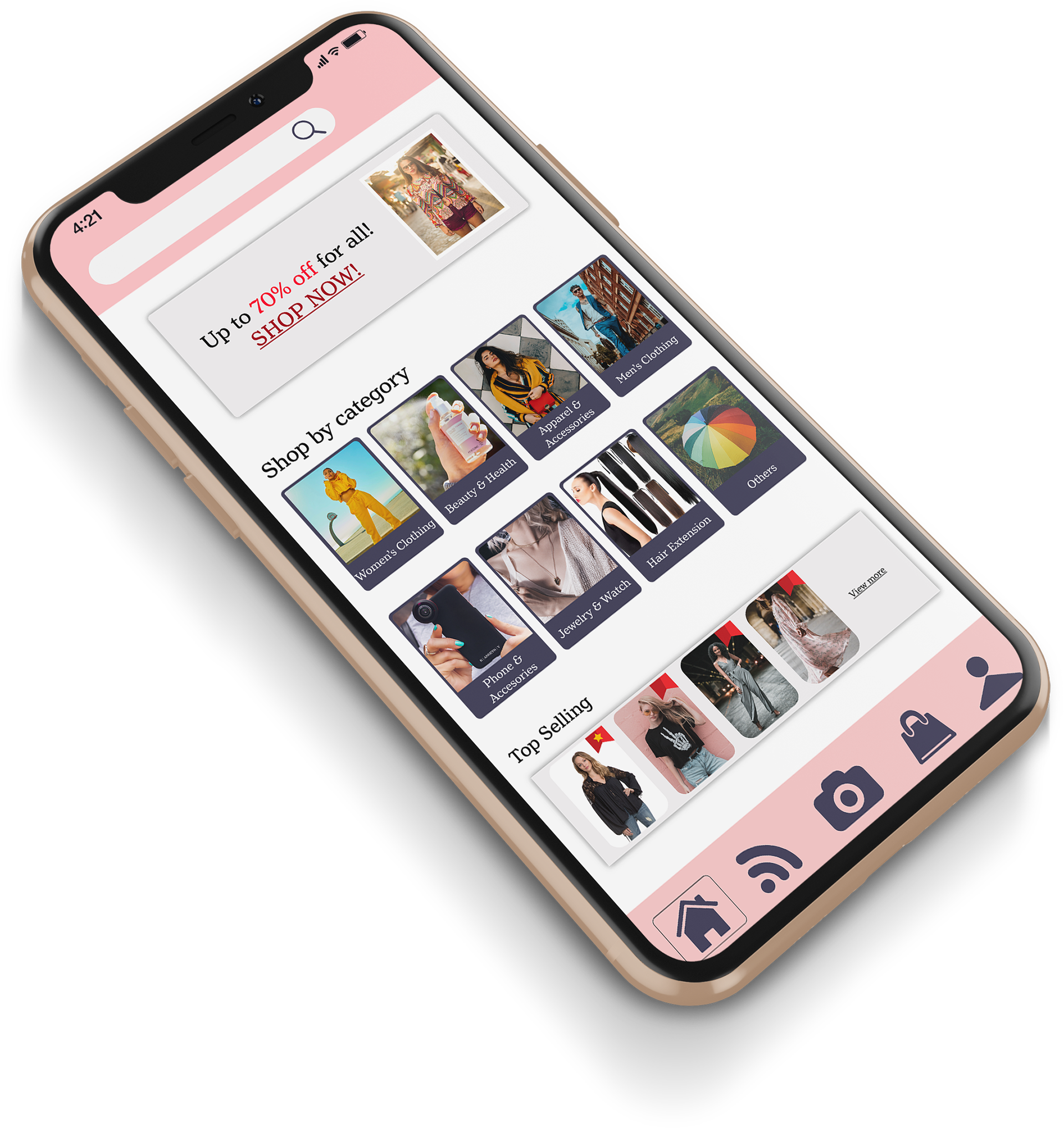
Snap it. Shop it.
OVERVIEW
A mobile app that helps people look and shop
for clothes that they are interested in buying.
The purpose is to provide an efficient service
to search for fashion clothing.
The target audience will mainly focus on women, teenagers, and fashionistas.
for clothes that they are interested in buying.
The purpose is to provide an efficient service
to search for fashion clothing.
The target audience will mainly focus on women, teenagers, and fashionistas.
ROLE AND RESPONSIBILITIES
I was responsible for the entire project
from researching to designing a logo, to UI design.
from researching to designing a logo, to UI design.
APPLICATION
Adobe Illustrator, XD, and InDesign
RESEARCH AND
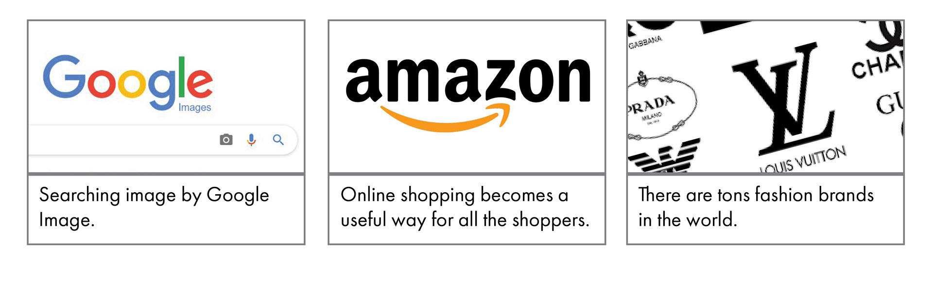
As societies continues to grow, it is evident that fashion is an important necessity which people continuously consume. By using the google image tool, I found interesting information through the pictures I found. They inspired me
to design an app for shopping, but more than that, an app that can look for clothes through images.
to design an app for shopping, but more than that, an app that can look for clothes through images.
DISCOVERY AND IDEATION
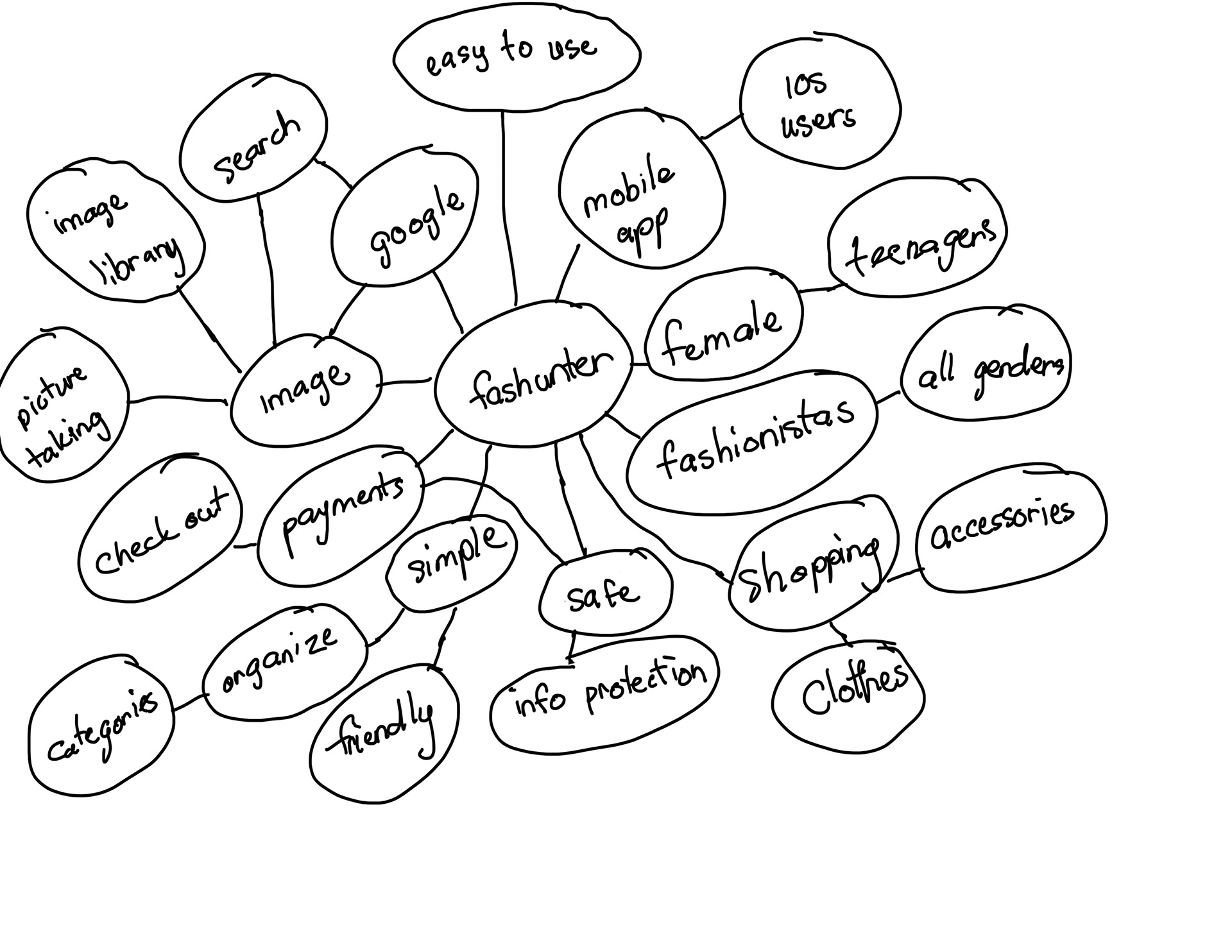
Mind maping was helpful to gather insight on my own needs
and the needs of my target audience.
This activity revealed three key focus areas: simplicity, elegance, and sophistication.
and the needs of my target audience.
This activity revealed three key focus areas: simplicity, elegance, and sophistication.
DESIGN DECISION
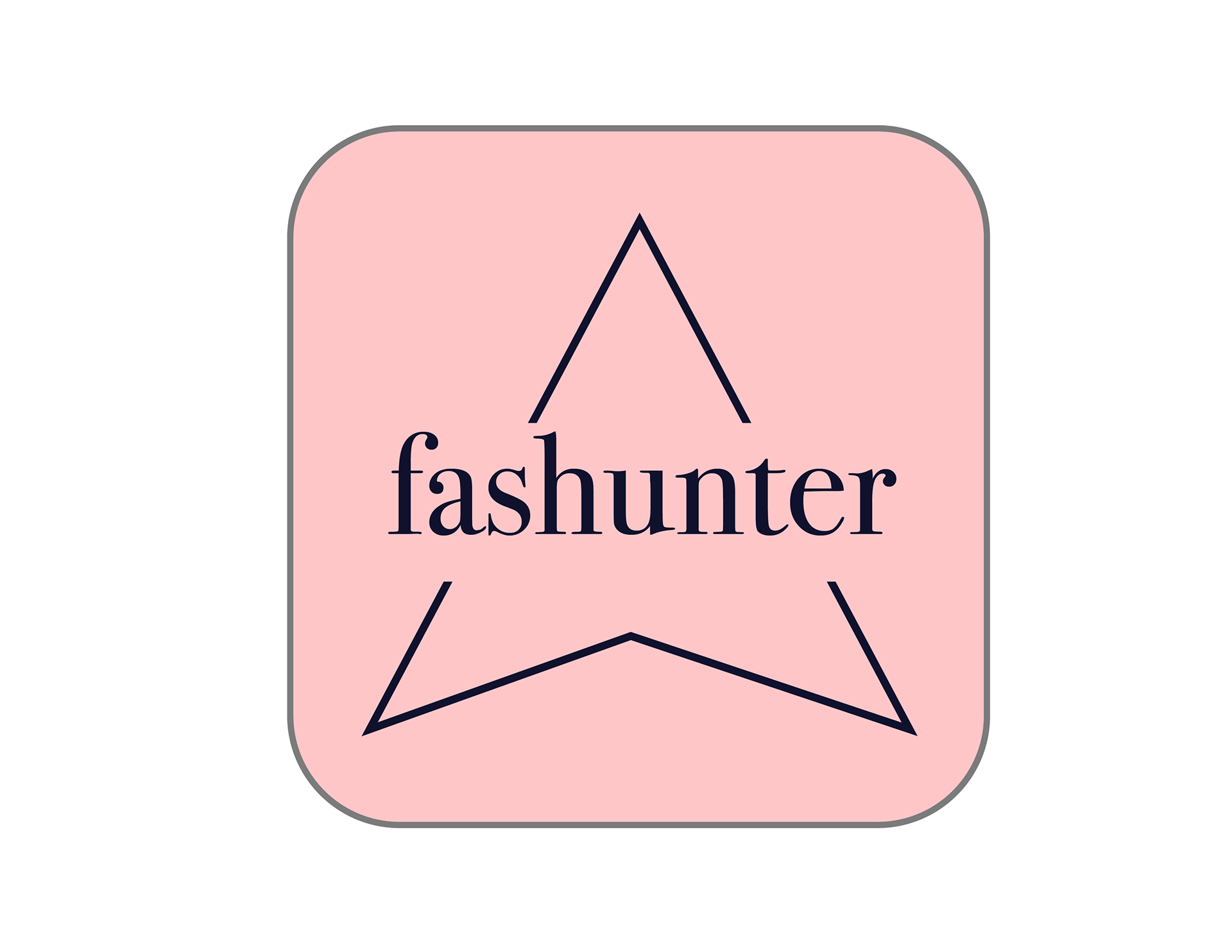
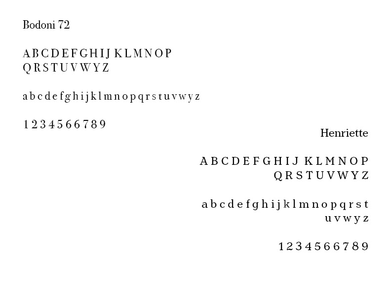
Typography: To bring out the elegance
and sophistication for the app, I decided to use Bodoni 73 typeface for the app name and logo.
and sophistication for the app, I decided to use Bodoni 73 typeface for the app name and logo.
Color: Pink is perhaps the most divisive of colors in fashion history which shows femininity and elegance. Therefore, baby pink matches with the app’s purpose.
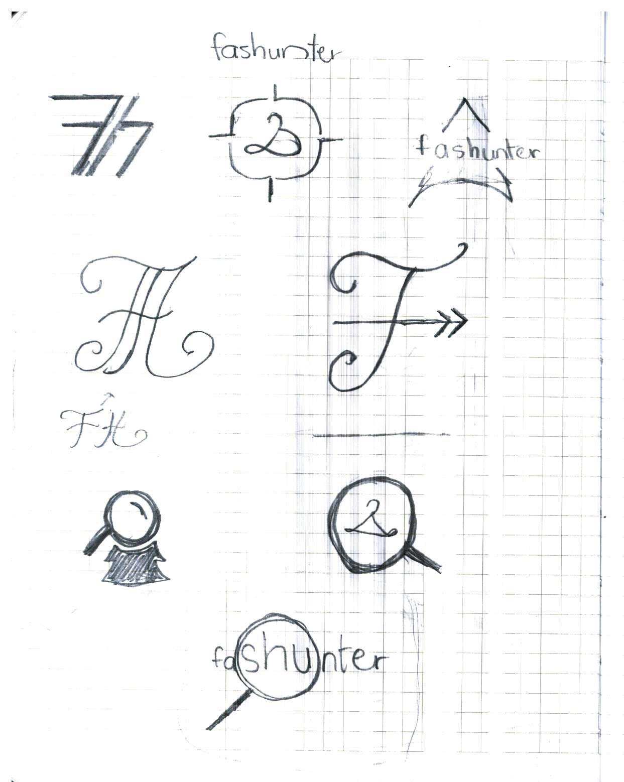
Concept: After many sketches, the most successful concept included an arrow to represent the “hunter”
and pink representing “fashion.” This minimalism approaches to the logo can be interpreted as friendly, simple, and elegant.

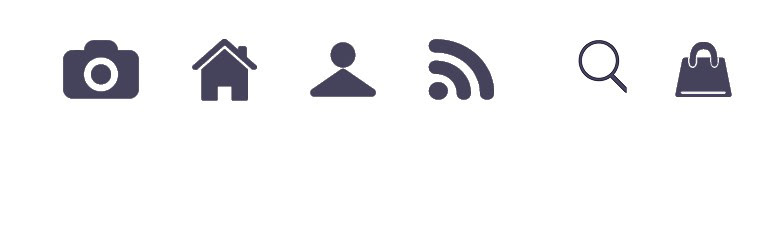
VISUAL SYSTEM
Logo
Icons
Colors
Typography

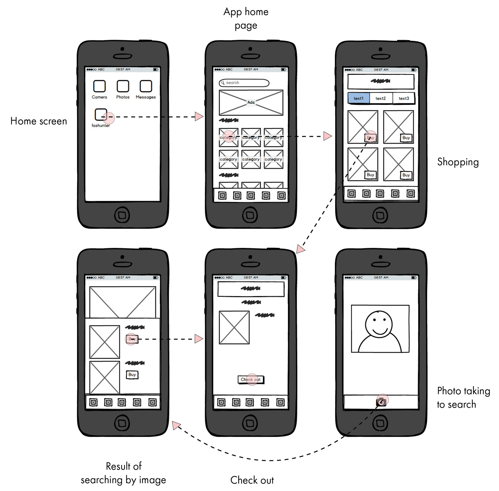
LOW-FIDELITY WIREFRAMES
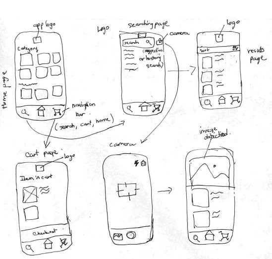
Low-fidelity wireframes are quick paper sketches
to make the idea clearer and more definite.
With the help of them, the concept was identified and visualized.
to make the idea clearer and more definite.
With the help of them, the concept was identified and visualized.
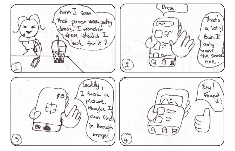
STORYBOARDS
TESTING
SOLUTION
In order to make sure the app intended purpose worked correctly
and matched with what users need,
I tested it out in a small group of classmates.
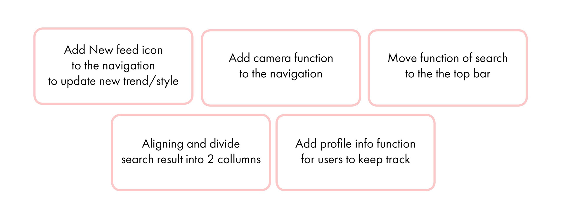
It turned out that the users would like to discover the styles
through not only categories, but also through newsfeed.
The users also wanted the app to be simpler,
and have the most vital functions be presented to be quickly seen.
and matched with what users need,
I tested it out in a small group of classmates.
It turned out that the users would like to discover the styles
through not only categories, but also through newsfeed.
The users also wanted the app to be simpler,
and have the most vital functions be presented to be quickly seen.
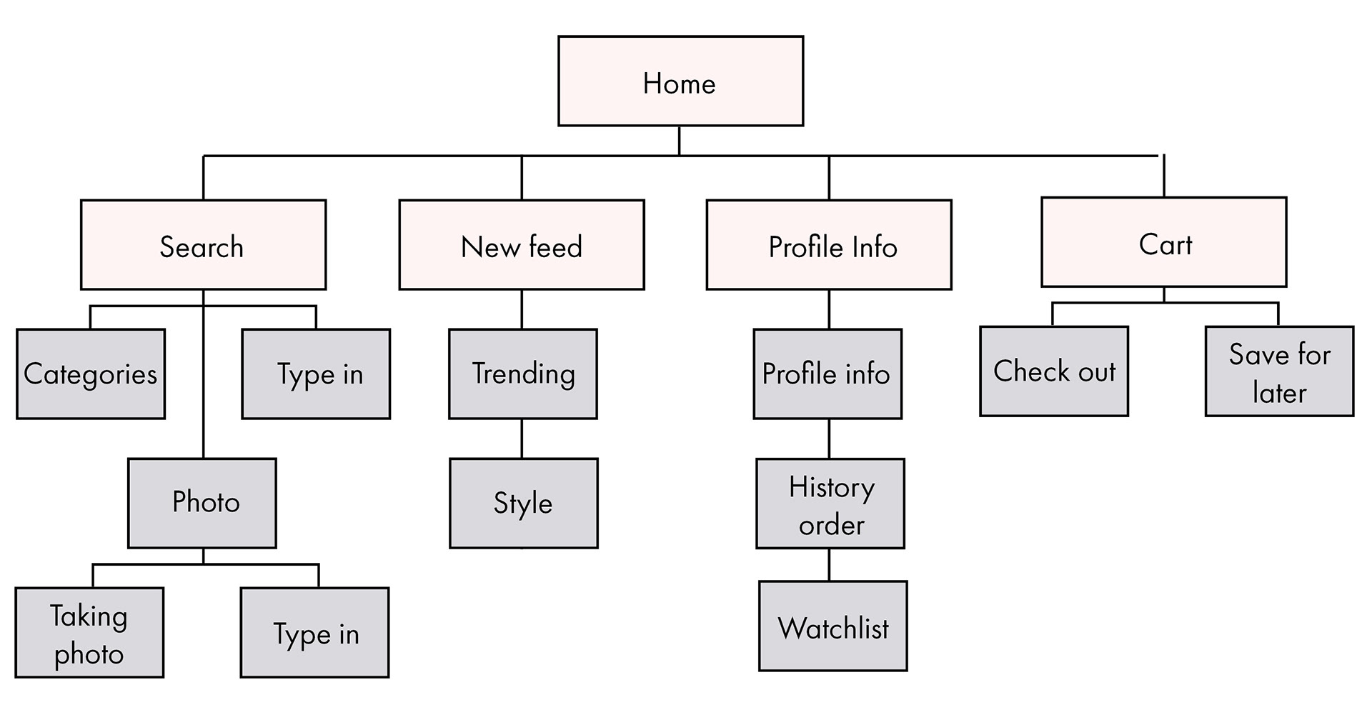
INFORMATION ARCHITECTURE
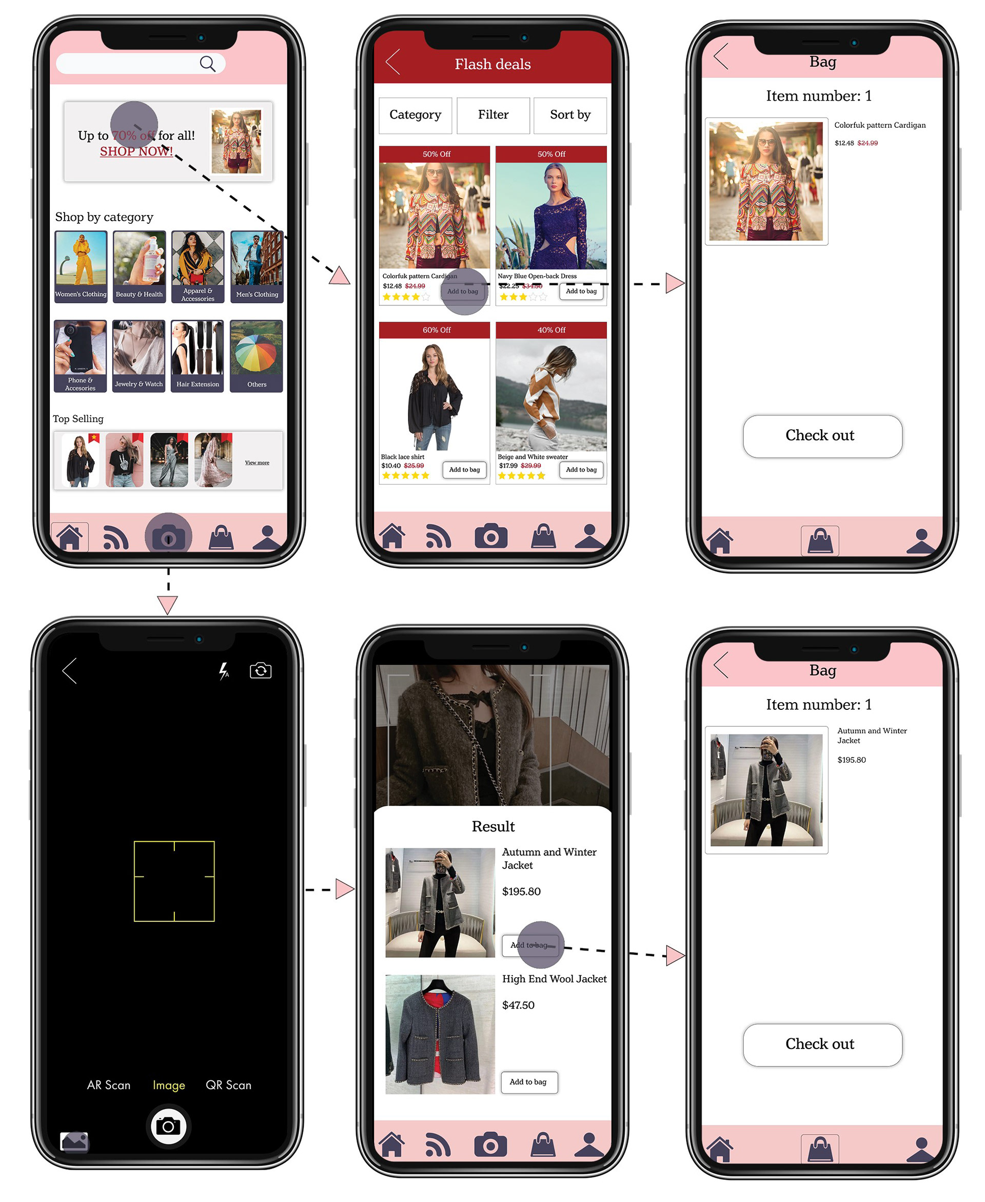
HIGH-FIDELITY WIREFRAMES
INTERFACE DESIGN
REFLECTION
Next steps
1. Spend more time on user research and conduct in-depth interviews to create a refined solution
2. Improve the visual design which I would generate multiple directions for user flow.
3. Due to the limited time, only certain issues were brought into the spotlight. Many other issues need to be addressed in the next version.
What did I learn?
I understood that User testing is a very powerful tool that helped me understand which parts of the design frustrate people, where they get confused, and what keeps them from converting.
Challenge
Making quick decisions and dividing the time between different stages of the project was challenging.
Being one of the target audience myself it was natural for me to bring my own biases and preferences into the design decisions. Conducting user testing helped me to overcome this and understand the bigger picture.